The paper decides how deep letterpress bites
Impression depth is settled with the fiber, and the real limit lives on the back of the sheet. Of the 99 production routes in our bank whose technique names letterpress or typography, 18 record the back as the point where the piece breaks.
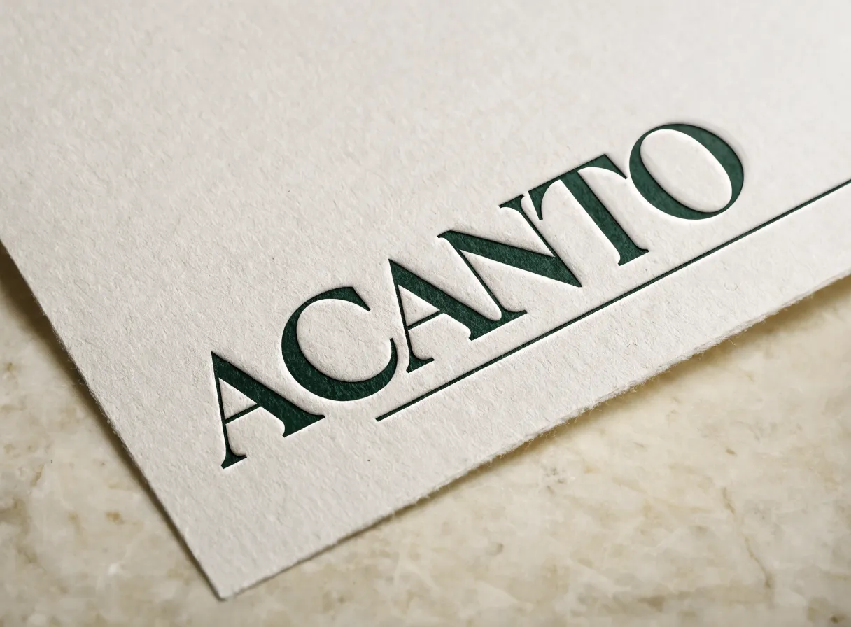
The fiber of the paper fixes how deep the impression goes. Long fiber cotton compresses and stays compressed, so the impression holds the shape of the letter. The true ceiling lives on the back of the sheet, where every impression leaves a shadow. Paper weight therefore follows whether the piece prints on one side or on both, and that gets decided before the artwork goes out.
Letterpress reaches the finger before it reaches the eye. You run a fingertip across the letter, it drops to the floor of the impression, climbs the wall and returns to the surface of the sheet. That three beat trip is the whole craft, and the paper is what decides it.
The bite lives in the fiber
The plate pushes and the fiber accepts. A long, lofty fiber, cotton for example, compresses and stays compressed, so the impression holds the shape of the letter. A short fiber pushes back harder, and once the pressure passes what it takes, the sheet bursts and leaves white fuzz along the edge of the impression.
Our bank confirms it. Of the 99 routes whose technique names letterpress or typography, 67 carry cotton written into the material.
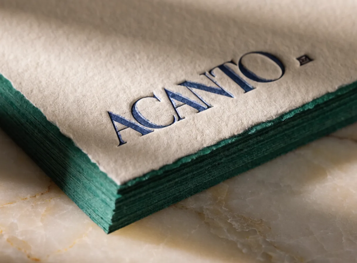
The back of the sheet is the true ceiling on depth
Every impression leaves a shadow on the other side of the sheet, and the limit lives there. Of those same 99 routes, 18 name the back of the sheet in the field that records where the piece breaks. Above it sits the painted edge, noted in 22, and behind come register and tone with 9 each.
The spec sheets say it in shop words. On a cotton letterhead the note reads that the relief marks through from behind and the ghost shows on the back. On a card and envelope set, that the impression bites too far, shows through, and ruins a double sided card.
That is where the decision that orders everything else comes from. On a piece printed on one side the shadow stays hidden and nobody raises it. On a letterhead with the header up front and the details on the back it lands on top of the reading. Paper weight becomes the technical decision of the job right there. You raise the caliper and the shadow stays inside the paper.
The paper weight that carries a head on impression
Deep impression work starts with heavy cotton paper in the flat sheet, 300 to 600 grams, which is what the first step of that route calls for. At the low end of the range the well appears when the light comes in from the side. At the high end the letter drops far enough to read head on, with the piece flat on the table.
When the caliper of a single sheet falls short, the path is to laminate two plies and work on that duplex, which gives body to take the pressure and edge to paint afterward. Nine of the 99 routes carry that lamination written in as a step. For engraving and deep relief the cotton board goes up, 600 to 900 grams, following the first step of the route for a blind emboss sample.
The thin rule and the heavy letter share a press
In a single lockup everything takes the same pressure, and geometry is what separates the result. A heavy letter spreads the load across a wide surface and comes off the press with a clean wall. A thin rule concentrates that same load into one line and sinks too far, or carries a thinner film of ink and reads washed out.
It is worth saying how often this gets recorded. Two of the 99 routes name the rule in the field for where the piece breaks, and one of those two is the green sheet that opens this entry. Its spec sheet says the thin rule disappears or fattens depending on how the lockup ends up, and that on that piece it is the first defect to show. Few routes, large consequence, because it lands on the most visible element of the design.
There are two honest ways to solve it. The first one belongs to design. Raise the weight of the rule until it matches the thinnest stem of the typeface beside it. The second one belongs to the shop. The artwork splits into two plates and the sheet takes two hits, one calibrated for the letter and one for the line. The spec sheet of a full identity set carries that path written in, letterpress in two hits on the card.
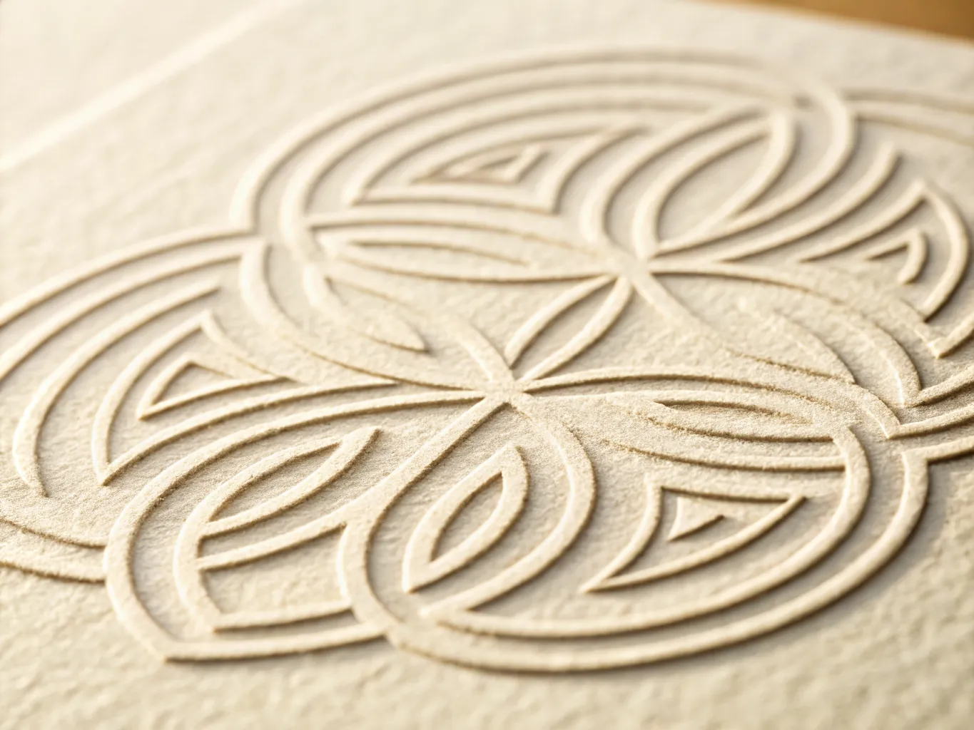
The die decides the shoulder
Photopolymer comes straight out of the vector and reproduces fine detail with fidelity. A brass engraving holds the impression pass after pass and leaves the shoulder of the letter more defined, which is the wall your finger recognizes. For blind emboss the die arrives in two pieces, male and female, die and counter die, and the first step of that route says depth and bevel angle get decided right there. In the close up without a single drop of ink, raking light shows that bevel line by line.
That same spec sheet carries a warning worth repeating. On cotton, blind emboss relaxes with humidity and settles lower than it came off the press. Ask for the depth with that settling already figured in and the piece ages toward the place you imagined.
The painted edge asks for a clamped block
Color on the edge travels with this technique, and 27 of the 99 routes name it. The block gets trimmed square, clamped between two plates, and the color goes onto the edge in thin coats, with the drying done under pressure. That is how the fifth step of the block route describes it.
That order answers to a physical reason. Cotton is thirsty and capillary, so paint that touches a loose edge travels between the sheets and reappears as a line of color on the face of the card. Clamped, the edge behaves as one single surface and the color stays where you put it. A thick coat brings the other defect. Cured without the clamp, it cracks the moment you fan the block.
It helps to see it counted in steps. A letterhead sheet printed in one green runs 5 steps and touches 3 kinds of shop, the platen letterpress shop, the die cutting shop, and packing and kitting. The same paper turned into a card with a painted edge and a deckle edge runs 6 steps and touches 6 kinds of shop, because the bindery that laminates the duplex comes in, along with the engraving and embossing shop, the guillotine that trims the three straight edges while leaving the deckle intact, and the finishing shop that clamps, paints and dries. That natural edge appears in 11 of the 99 routes. Holding the chain in that order is the part the Atelier's finishing treats as a craft of its own.
What to ask for so it comes out right the first time
Three decisions get made before the artwork goes out. Settle whether the piece prints on one side or on both, because that fixes the caliper your impression needs to stay inside the paper. Measure the weight of your thinnest rule against the thinnest stem of your typeface, and if the distance is wide, ask for two hits from the start. Ask for a physical paper sample with the impression already on it, so you can read it under the light of your own desk and with your own finger.
With those three questions settled, the paper enters the job as a decision already made, and the bite lands where you imagined it.
Questions that come up often
Which paper holds a deep letterpress impression?
Cotton paper. The long, lofty fiber compresses and stays compressed, so the impression holds the shape of the letter. A short fiber pushes back harder, and once the pressure passes what it takes, the sheet bursts and leaves white fuzz along the edge of the impression. In the Atelier's bank, 67 of the 99 routes whose technique names letterpress or typography carry cotton written into the material.
Why does the impression mark or show through on the other side of the paper?
Every impression leaves a shadow on the other side of the sheet, and the limit on depth lives there. On a piece printed on one side that shadow stays hidden. On a letterhead with the header up front and the details on the back it lands on top of the reading, and paper weight becomes the technical decision of the job, because raising the caliper keeps the shadow inside the paper. In the Atelier's bank, 18 of those 99 routes name the back or the other side of the sheet in the field that records where the piece breaks.
How many grams does the paper need for a deep impression?
Deep impression work starts with heavy cotton paper in the flat sheet, 300 to 600 grams, which is what the first step of that route calls for in the Atelier's bank. At the low end of the range the well appears when the light comes in from the side. At the high end the letter drops far enough to read head on, with the piece flat on the table. For engraving and deep relief the cotton board goes up from 600 to 900 grams. When the caliper of a single sheet falls short, the path is to laminate two plies and work on that duplex.
Why do the thin lines in my design come out badly while the heavy letter comes out clean?
In a single lockup everything takes the same pressure, and geometry is what separates the result. A heavy letter spreads the load across a wide surface and comes off the press with a clean wall. A thin rule concentrates that same load into one line and sinks too far, or carries a thinner film of ink and reads washed out. There are two honest ways to solve it. The first one belongs to design, raising the weight of the rule until it matches the thinnest stem of the typeface beside it. The second one belongs to the shop, splitting the artwork into two plates and running the sheet through two hits, one calibrated for the letter and one for the line.
How is the color edge on cards painted and why does it sometimes crack?
The block gets trimmed square, clamped between two plates, and the color goes onto the edge in thin coats, with the drying done under pressure. That order answers to a physical reason. Cotton is thirsty and capillary, so paint that touches a loose edge travels between the sheets and reappears as a line of color on the face of the card. Clamped, the edge behaves as one single surface. A thick coat cured without the clamp cracks the moment you fan the block. In the Atelier's bank, 27 of the 99 routes name the painted edge.
Follow the thread
Three doors to carry the journey forward.
Have you imagined yours yet?
Tell us what you imagine and who it is for. We listen first, and from there we create it with you until you hold it in your hands.